The Pedagogy Coach is a reflective thinking platform for early childhood educators in Australia, founded by an educator for the moments when a question comes up and there is no mentor or colleague to think it through with, and instead of handing over quick answers it helps them work the question through over several days.
When the project started there was no brand and no designed product, only a single functional screen the founder had built as a reference while the conversational AI was being developed, and since the responses come from an AI, the platform had to feel like a colleague thinking alongside the educator rather than a chatbot.
Scope
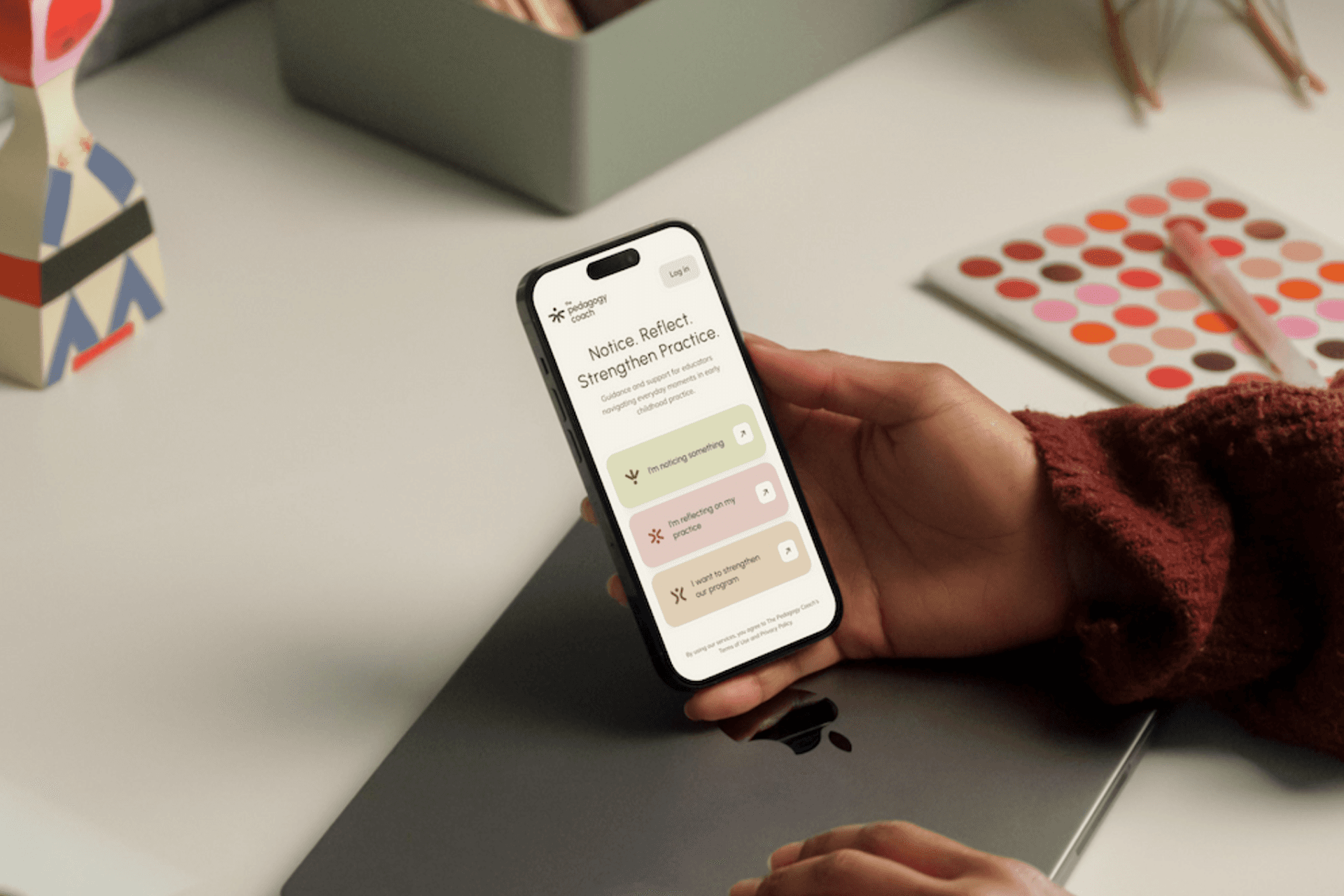
Working freelance with a full-stack developer, who built the platform and its AI, I designed the brand from scratch, starting from the founder's questionnaire and her refinement of the copy, and took it from the logo and the icons of the three pathways to the colour system, the photography principles and a full set of brand guidelines.
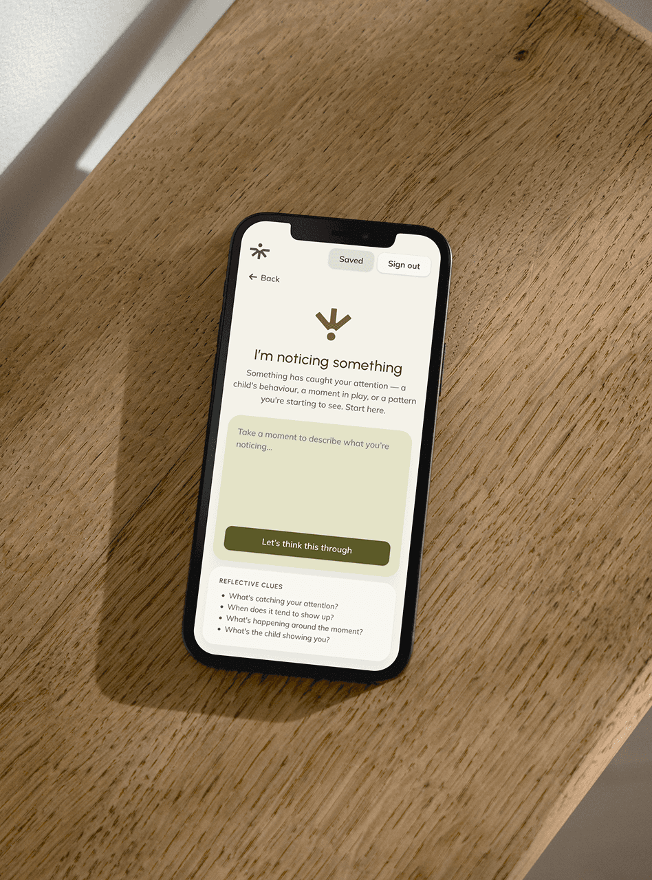
On the product side I designed the UI of the app around the three pathways the founder had defined, for desktop, tablet and mobile, along with the marketing landing page, a system of tokens and text styles documented for development, and design QA on the live build.
Choices
The response screen kept a chat-like layout, because it is a format educators already know, while the visual style and the pacing kept it from feeling like a chatbot, with the response flowing as page text below the educator's words and the reflective questions set apart, so the whole exchange keeps the calm and closeness of the brand.
For educators unsure which pathway fits, the founder's brief proposed a fourth card or a free-text box as the front door, and I proposed a quiet invitation beneath the three cards instead, because the pathways carry the brand and returning educators usually know where they want to go, which the founder agreed with.
Outcome
The Pedagogy Coach is about to launch with a brand and a product that speak the same language, so an educator meets the same calm character on the landing page and inside the app, where each pathway has its own colour and icon and it is clear at a glance where every reflection belongs.
What began as a single functional screen is now a complete identity and a product designed to feel like a colleague thinking alongside the educator rather than a chatbot, built on a system of tokens and text styles that lets the developer implement it consistently and keep adding to it as the platform grows.