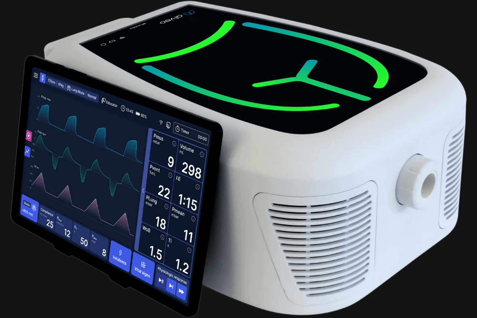
IMT Analytics builds precision medical devices for respiratory care, and its existing ventilator worked reliably but carried an interface designed more than ten years earlier, where deep menus and hidden functions slowed down the people using it.
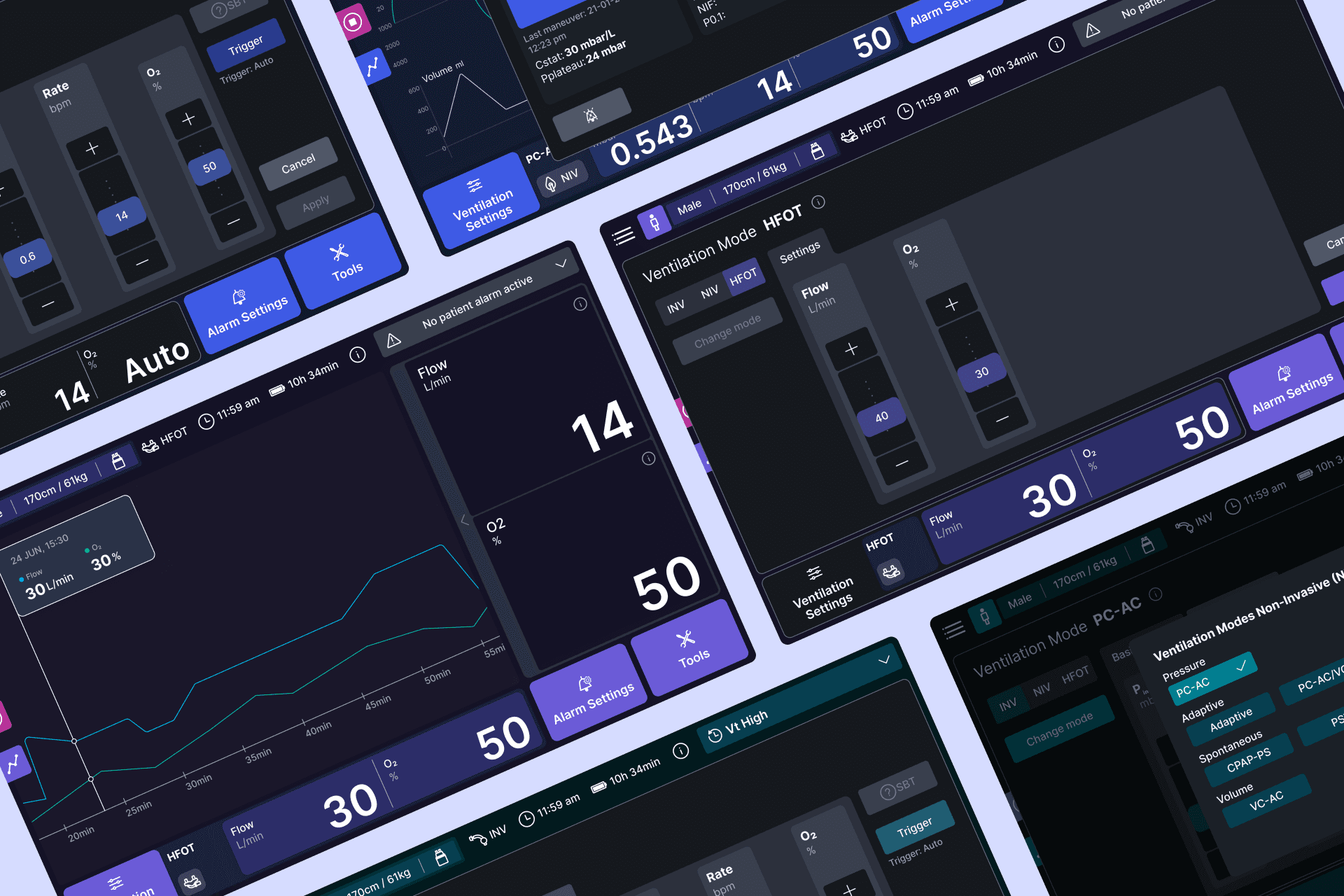
The redesign covered two products at once, the ventilator and the Alveo training simulator, and almost every main function of the ventilator had to fit on a single screen of 1090 by 680 pixels. Since that screen is read from about two metres away and often in a darkened room, and since most of what a clinician needs from it is numbers, legibility governed nearly every decision that followed, always within the regulatory requirements of a medical device.
Scope
I owned the interface execution across both products, which covered the colour system and the behaviour of the alerts as well as the component library that the ventilator and the simulator would share. I worked alongside the UX Lead and the client's product manager, who ran the testing of my prototypes with clinicians, and I stayed with the three developers through handover and the iterations that followed from it.
Rather than build each component from scratch I assembled them from a small set of shared atoms, which kept the system light enough for the hardware and meant that a change made for one product would not break the other. The component that took longest was the alert threshold slider, because it had to hold a high limit, a low limit or both at the same time, and it had to stay draggable while its value remained visible with a finger on the screen.
Choices
The hardest decision on the project came down to the overlays, which originally used a background blur so clinicians could still perceive the patient curves and any alert firing behind an open panel, and that mattered because they cannot afford to lose sight of the patient while they adjust a setting. The effect cost too much on the device's hardware and the software turned slow and unstable, so we dropped it for a solid dark background and accepted a real loss of awareness in exchange for a system that stayed responsive.
Typography was decided by those same conditions, so I compared candidates for numeric clarity at distance and at small sizes, and Inter came out ahead on x-height and on small-size legibility, with a variable format that let the system shift weight without carrying extra files.
Outcome
The system ended up at over 170 components and 1,500 variants covering both products and the three ventilation modes of the ventilator, after a design phase of about 1.5 years.
Both devices were shown at industry fairs in Europe and the United States, where the feedback was outstanding, though the ventilator was still in production when my part of the work finished, so there are no post-launch numbers to report.